Uniform blog/Arming business teams with visibility and control creating great UX
Arming business teams with visibility and control creating great UX
Arming business teams with visibility and control creating great UX
Developers have gained a lot by moving away from DXPs and adopting headless tools, especially high performance and flexibility. However, business teams, such as marketing and e-commerce, have lost a lot, notably control of the presentation and understanding of their audience’s exact context. This makes their day-to-day work slower and more frustrating. Worse yet, those business professionals might quit and join a company whose tools support instead of obstruct them from getting work done.
Today, we’re releasing two features that restore control to business teams—without technical sacrifices:
- Canvas: The no-code visual editor in Canvas has been completely revamped to put your work front and center. With an integrated, responsive live preview, you can see how your page looks while building or editing it and, along with new layout-control options, orchestrate the exact context for your audience.
- Project Map: Project Map brings structure to the pages you’re building for a website or app, placing you in the exact spot of your audience’s journey. That capability converts a legacy system’s page hierarchy to a modern composable architecture, accelerating the onboarding process and content velocity for business teams without impacting technical performance or long-term flexibility.
Both features are now available for all customers, partners, and Uniform’s free-tier users. Check out the related documentation and try out the features in your Uniform account.
Building with Canvas previews: a new window on your content
Throughout my marketing career, I’ve built a lot of webpages. No matter which tool I use, the Preview button is my best friend. Not just because I’m prone to typos, but because it shows me how my audience will come to my page and their context for reading it. (I’m not claiming I always get this right, but I do try.)
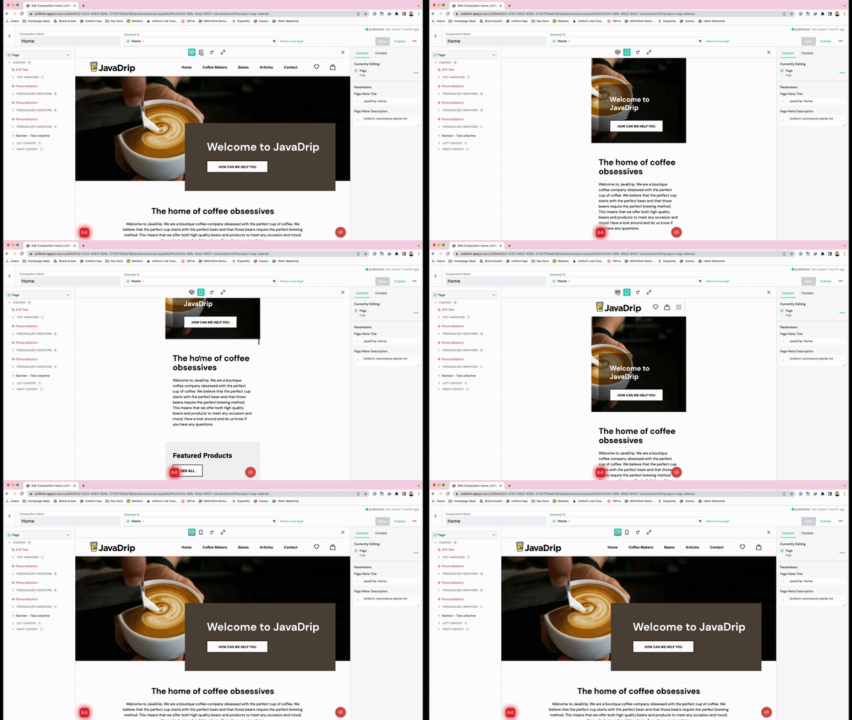
Our updates to Canvas make this seamless: Your preview sits right in the middle of the interface, showing what you’re working on and how it will look to your audience. There’s even a handy button to switch between desktop and mobile previews.

This is what marketers and merchandisers using headless architectures have been dreaming of: The ability to build a page with content from any of your connected sources and see exactly how the page will look in any screen size before publishing it. No more “publish and pray” or those heart-stopping moments when you realize that things look wrong after they’re live. (We’ve all been there and it feels pretty bad.)
Composing with Canvas: everything at your fingertips
How do I build a page with Canvas? I’m glad you asked!
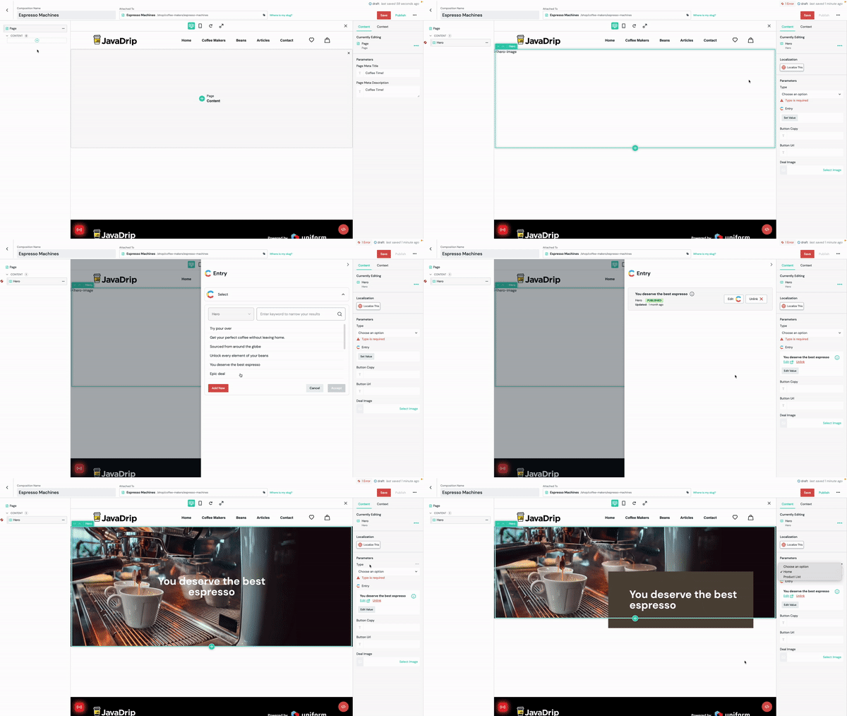
- Create a composition, which is often a page of your website or app or, but can also be delivered to a kiosk or email. A Uniform project can support multiple page types, each of which you can tailor for specific roles and permissions. For example, your commerce team manages category homepages while your growth team controls landing pages. Additionally, each composition type can access various components, leading to a faster build process and ensuring brand uniformity. You now have a blank canvas to work with. (Do you see what we did there?)
- On the left side of the screen, add a component, e.g., a “hero,” a content carousel, or another specialist component. The selection of components is dictated by your page type.

- Build the content. Uniform Mesh’s powerful integrations facilitate content sourcing from all connected services: a CMS, commerce platform, DAM, or search like Algolia. Simply connect the component to the entry you need or create one in the system. This is the same process you’re leveraging a modern headless source or a connected legacy platform like Sitecore. Alternatively, enter content directly into Canvas. That option is great if your content is for a short-term project or is really dependent on its context, as in the case of a CTA button or an event registration page.
- Make your page look great. You can also control the presentation of your content with Canvas, firstly by choosing and ordering your components. Each component can also contain an incredible array of options and variants, which can easily be deployed by designer and front-end engineers. This gives page editors far more flexibility in how to tell stories without the need for developer support Also for designers, those features eliminate a load of custom or one-off tasks since, once a component or variant is in Uniform, it can be used for all subsequent pages. Created is an ever-expanding library without constant manual updates, which affords marketers unlimited flexibility and compliance with the brand’s design language. For developers, it also has : Short term, they have far fewer tickets and Slack requests to handle because they no longer need to support publication or layout changes. That means that they can focus on value-add features and plan sprints more accurately. Also, unlike most visual tools for headless systems, Uniform is very quick to implement—instead of having to mark up their output in order for it to function they just have to add Uniform SDKs and it works! Long term, moving presentation data to Uniform lets headless systems be truly headless. They can eliminate extra fields to control a page’s featured item or text alignment options for a hero image. This can reduce the number of content types they need to manage, and content can much more easily across services to accommodate evolving needs and omnichannel requirements.
- Sometimes we all need the boss to sign off. Fortunately, Canvas makes it easy to share a single link of the draft page so that approvers see everything in full context, accelerating your workflows and keeping your content moving. Whether it's your legal team, an external partner, or just a slightly neurotic product marketer (not me, of course), it only takes two clicks to send the content their way. For security, previews can be password controlled and to further manage workflows, you can restrict publication permissions to certain roles so that only the right people can give the final go-ahead.
- Once you’ve built a page, perfected its layout, and obtained all the signoffs, it’s time to publish. Whether it’s a website, an app, an email, or an Alexa skill, publishing in only one click on Canvas. No need for developers to activate anything because business teams have complete control of their own workflows and schedules.
Reading the Project Map
To build a great digital experience, you need to understand your audience’s journey. But when headless tools decouple content from presentation, that’s really difficult. That’s why we’ve built Project Map, which combines a traditional sitemap’s structure and control with the the speed and agility benefits of composable architectures. Project Map is unique in the composable space, and we’re beyond excited about how it will boost the efficiency and effectiveness of business teams.
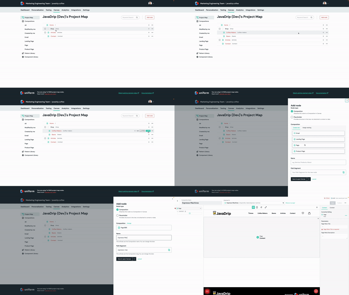
Through Project Map, you can easily see at a glance the structure of your project and pinpoint exactly where in the customer journey your content will appear. Not only can you create content in the right place faster, but you can also easily find the relevant content for reuse or redeployment to reduce duplicated effort and deliver faster. Rather than an abstracted “content lake,” where you need to search with the right term to find what you’re after, Project Map takes only a quick scan to find the right answer.
To start using Project Map, navigate to where your content will be in the structure, click Create, and name the content. Project Map then ensures that your content is in the right place and automatically handles your URL-management. Then you can dedicate yourself to building pages, worry free.

Achieving composable without compromise
Canvas and Project Map bridge the experience gap for business teams in a composable architecture and arm them with the tools to work efficiently and independently. The easier, more familiar experience that emerges for business teams not only accelerates content velocity but also builds team morale, in turn raising your employee retention rate. You can then devote your efforts on improvements rather than training. Additionally, as new employees come on board, those tools are a cinch to learn.
Crucially, Canvas and Project Map deliver all of these benefits without reducing the speed or flexibility of a truly composable setup or dictating the tools required. That means that marketers are empowered with great tools without impacting developer flexibility or speed. Ultimately, that’s what our mantra, composable without compromise, means. In this video, you can see me walk you through how to use the new features to quickly build a page that combines multiple data sources with full preview and publish it without any developer support.
If you're a developer who wants to learn more about how to set this up for your teams, or check out our documentation or you can watch videos on Canvas and Project Map.


